VICTORIA Project
Designing user interface for the analytical application
The Challenge
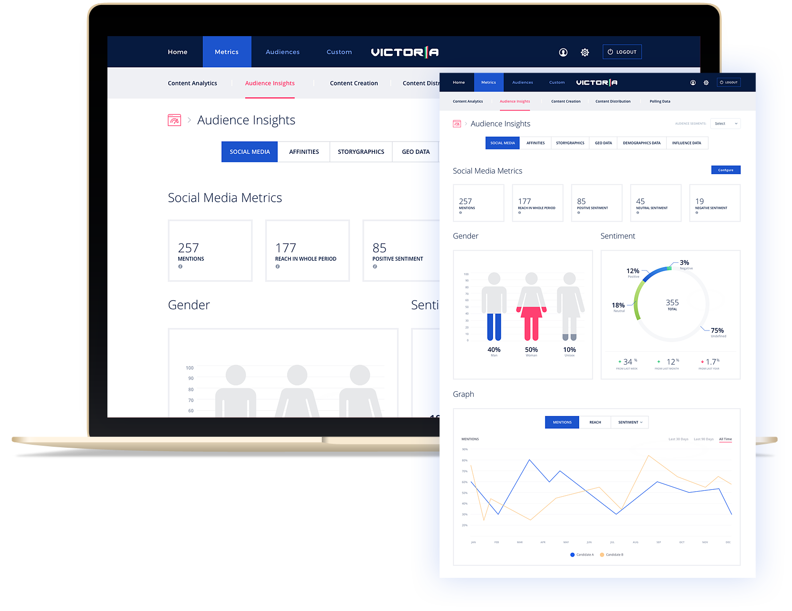
The main challenge for this project was designing full, clean functionality for analytical data and to prepare individual views of chart types, diagrams and tables. So that the analytical data looks clear and navigating through them was simple and enjoyable.
Details
The project was included designing readable screens of individual sections, such as the login form, dashboard, layout of three different types of menu and preparation soothing colors for all project. This translated into a preparation of 11 screens, which functionality is based on Machine Learning and Big Data technologies.
Prototypes
For this project was prepared interactives screens, which imitate the operations of individual subpages.
Charts matched to the data
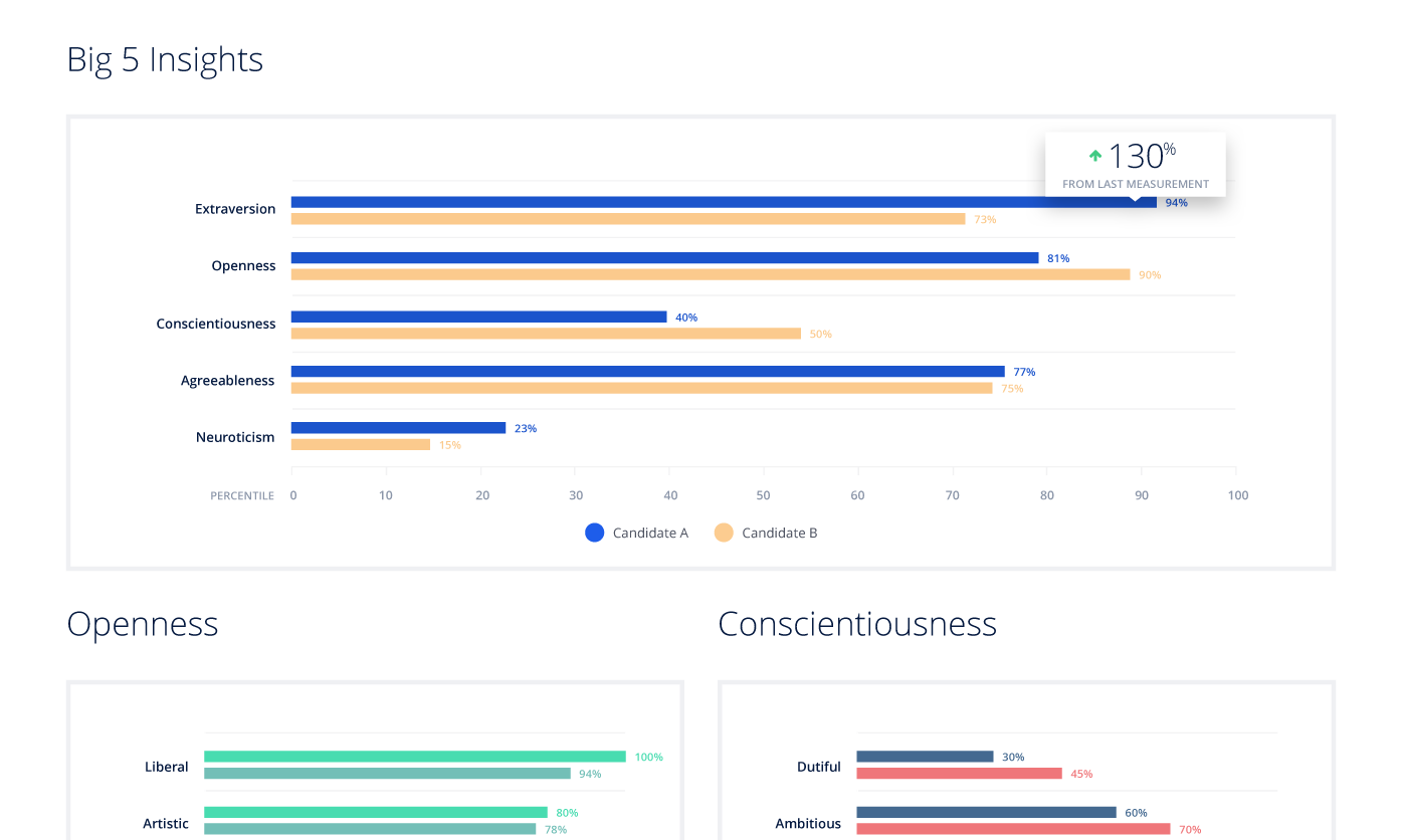
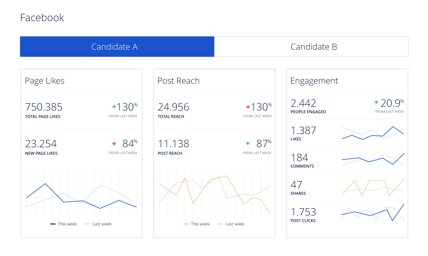
In this project, I was prepared above 17 different types of charts and diagrams, which were meant clearly presenting numerical data collected by the application.
Mainly, this was charts bar, pie, column and line charts. Also, was designed the special types of visualization data, such as similarity, geolocation and regression charts.
The use of various UI / UX solutions
Numerous different solutions from User Interface and User Experience positively influenced simplicity and functionality of a whole application. Adoption clear design screens, readable font and added the right color set, it allows the user find yourself quickly in the application, despite a large amount of data.
Summary of this project
SCREENS
DIFFERENT TYPES OF GRAPH
TRACK TIME


